From the Water Cooler
As a ‘water cooler’ of sorts for this community, we meet some amazing people. Matt Mowrey shares with us a really useful technique to create a discoverable income statement using PowerPivot. This post runs a little longer than usual to describe the technique, but totally worth it.
A Problem Applying PowerPivot to Income Statement Reporting
When I was first introduced to PowerPivot five or six years ago, I knew it would serve me well in my FP&A function. I spent a lot of time learning about PowerPivot and DAX,with the goal of programming our host of reports, including a discoverable income statement pivot table. This report, while not the prettiest, is highly useful for variance analysis.
Please click here to download the workbook to follow along.
In it’s earliest phases, it looked like this:

Or this:

The crux of the challenge may be obvious: is the best practice to use dimension members (top graphic) or measures (bottom graphic) to create my income statement? Either way, both are U-G-L-Y and something was missing. Coming from an FP&A background, I wanted to mimic the Excel interface of a budgeting and planning system as much as possible. This would mean one value (measure) in the values box of the pivot, then a layering of row/column dimensions at the intersections of the reporting requirement.
Searching for a solution led me to the P3 Adaptive blog and David Churchward’s posts on The Art of the Cascading Subtotal. With practice, the pattern finally sunk in and I got the cascading subtotal “mechanism” to work, but it still wasn’t giving me the result I was hoping for. I won’t go into specifics, but I basically needed more control over my calculated members (e.g. gross profit, operating profit, net profit) and the way they displayed.
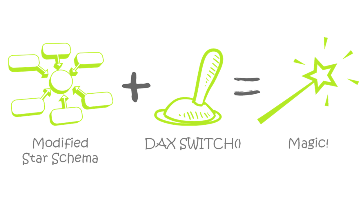
There’s already so much greatness in the query/ETL (Power Query), data crunching (PowerPivot), and display mechanisms of Power BI. But occasionally, I stumble across key concepts that revolutionize the way I approach my daily work. In this case, it’s an understanding of a simple star schema and using DAX measures within a SWITCH statement. These two concepts drive what I’m about to explain.
I often find that if a title resonates with me, it helps me internalize and make it a more permanent member of my arsenal. I call this one “A Star with a SWITCH”.
Starting Out: What a “Typical” First Pass of an Income Statement Data Model and DAX Measures
Below is a quick look at my starting point, which very much resembles the architecture of a planning and budgeting system. The fact table is on the bottom (General Ledger) and dimensions are on top, just as Rob teaches in his classes and books. I find that keeping visually organized is paramount.
In addition to the tables below, there’s a calculations table not pictured.

The first measure I always write is a harvester measure summing the values. There is an amount column in my GL fact table so the measure looks like this:
SUM GL Amt :=
SUM ( ‘General Ledger'[Amount] )
In my data model above, I have a sign issue that requires fixing (P3’s cascading subtotals post also had this issue). I personally like working with positive numbers; it’s also the way my company reports, so I want every number, whether income or expense, to be positive. My account dimension has a “report sign” column that lists a positive 1 or a negative 1 next to each account. The measure I write to convert my harvester measure uses the SUMX function, an iterator, that looks at each individual line and calculates appropriately.
GL Amt (Correct Signs) :=
SUMX ( Accounts, [SUM GL Amt] * Accounts[Report Sign] )

Because there is a relationship between the Account dimension and the GL fact table, the iterator looks at the report sign of each account row and multiplies the fact data accordingly. If I ever have a tough time determining whether to use an iterator, this example in particular helps me get my head right—I think of it as a warm up. “GL Amt (Correct Signs)” measure is now the basis for everything that comes next.
Take the Time to Define Your Report Requirements Upfront!
Within my income statement, I want to display two scenarios: Actuals and Budget. I’ve experimented with more scenarios than that (PTD, YTD, SPLY all work beautifully), but I’m keeping it simple for this post. Just know that your scenarios don’t have to stop with actual and budget—you can get into lots of great comparative analysis that may blow your end-users’ (maybe your CFO’s) mind.
It’s essential to define display requirements at this point because those will dictate your DAX going forward. Is your income statement a functional view, account category view, or something else? Most people underestimate the power of this step. By the way, in the P3 Adaptive Finance Level Up class, Austin Senseman presents a pattern that will blow your mind to create these different views without the more manual buildup I’m about to present. I’m perfectly content with my approach because it’s much less manual than the alternatives, but the class is worth checking out for that morsel alone.
To keep things simple, my income statement’s general display is by account categories—a typical income statement. If you’ve written income statement reports before, this is one of the easiest views to write. But, if you understand the basics of this approach, I encourage you to experiment using, for example, the org dimension for a more functional income statement view that includes business unit operating income. I’ve done it and it works beautifully.
This is how I want my income statement to display:
Revenue (with drilldown)
Cost of Sales (with drill down)
Gross Profit (calculated member, no drill down)
Operating Expenses (with drill down)
Operating Income (calculated member, no drill down)
Other Income & Expenses (with drill down)
Depreciation & Amortization (with drill down)
Interest Income & Expenses (with drill down)
Taxes (with drill down)
Net Income (calculated member, no drill down)
Creating the “Display” Tables – Evolving to a Snowflake Schema
Once you’ve nailed down this structure, the next step is to create a table with a row for each of these dimension members, including the calculated members (e.g. Gross Profit). It is this table that will eventually turn our star schema into a snowflake. There are different ways to do this, but for this example, I’m using a standalone Excel file and Power Query to bring it into my income statement data model. Here is what it looks like in the PowerPivot view:

Whenever I create my own dimension, I automatically number the rows with an ID. Let’s sort the Header on the ID column:

I created a “Summary” and a “Show Detail” column. We’ll use the “Show Detail”column as a toggle in the DAX programming to tell the report whether to—you guessed it— show detail or not. You’ll notice that there are no “1’s” by the calculated members, because there is no detail to show.
You can build out groupings to your heart’s content with this pattern. I’m also categorizing accounts with a subheader (child of header), for a total of two groupings in this model. When you reach the lowest level of your desired groupings, you need not include the summary and show detail columns.

The next step is to categorize each of your accounts in the account dimension with a header and it’s subheader. No account will have the name of a calculated member. In my account dimension, the column names are “Header” and “Subheader”.

I maintain my account dimension in an Excel file and use Power Query to bring it into my data model. If we change the categorization of, say, an expense, we revise the Excel file then on refresh, the Power Query brings the revised header into the data model. My account Excel file is refreshing centrally against a SQL table, so as new accounts are added, the appear in the file with a blank header. I’ve experimented with many ways maintaining dimensions that change often like account, but this is my favorite as of this writing.
Here is a quick look at where my data model stands now that I’ve added the header dimension and went from a star to a snowflake schema:

Writing the DAX Measures
We’re getting to the exciting part, but first, you need a DAX measure for each of the reporting lines we outlined as our requirement above. This is the point where you’ll want to clear your schedule, put on your headphones, and get in The DAX Zone. It doesn’t get much easier than looking at your reporting line requirements, making header and subheader tables based on those requirements, and then programming the DAX for the headers that aren’t calculated members.
If your brain has temporarily DAX-atrophied because we spent a couple paragraphs on filling out our data model, here’s where we’re going…
First, we break out the “base measures” for each of those scenarios:
Actual Amt :=
CALCULATE ( [GL Amt (Correct Signs)], Scenarios[ScenarioName] = “Actual” )
Budget Amt :=
CALCULATE ( [GL Amt (Correct Signs)], Scenarios[ScenarioName] = “Budget” )

Next, the measures highlighted in the red box correspond to the reporting line requirements by scenario.
When I program DAX measures like these, I try to keep the description short. These measure names will never be visible on reporting, so it’s nice to keep the names as short as possible. This is going to help keep the coding and reviewing of your DAX easier to read.
Here’s a look at Rev Act, CoS Act, and GP Act:
Rev Act :=
CALCULATE ( [Actual Amt], Headers[Header] = “Revenue” )
CoS Act :=
CALCULATE ( [Actual Amt], Headers[Header] = “Cost of Sales” )
GP Act :=
[Rev Act] – [CoS Act]
I’ve given you three examples above; at this point, you would continue programming measures to fill out your scenarios as I previously outlined in my report requirements.
One word of caution: the “header” you name above (highlighted in yellow) must be in the Header dimension, not the Account dimension. Including building the data model for this post, I’ve driven myself crazy when the outcome didn’t work. I checked and re-checked everything. I had to go back through each of my DAX measures and change them—total time to change was less than three minutes. Auditing your work always builds analytic character and makes you awesome! Don’t underestimate the power of mistakes.
NOW, we’re at the good part—where the magic happens. I’ve often called this the Greatest Formula in the World (GFITW), but I know others have different ideas. By the way, the original GFITW has worked wonders for me and can be applied to this pattern for, say, a trailing twelve months (TTM) scenario.
The Magical Use of SWITCH
Let’s take a moment and talk about SWITCH statements. Colin Banfield’s post goes into much more detail, but in general, SWITCH statements are DAX’s replacement of embedded IF statements. Embedded IF statements are hard to read, audit, and they’ll make your spreadsheet real clunky real fast.
The syntax of a SWITCH statement is this:
=
SWITCH ( expression, value1, result1, value2, result2, else )
Prior to this application, I used SWITCH statements largely to clean or normalize columns, so the expression was usually a column reference.
Listen closely: you can enter a DAX measure in the SWITCH result—it doesn’t have to be text! Colin points this out to some extent in his blog post, but the application for my work didn’t’ sink in until much later.
Let’s look back at the sets of DAX measures we created for each scenario (actual and budget) on our income statement. For each of those sets, we’ll need two additional DAX measures —a subtotal and a total.
Here is the syntax for the subtotal:
IS Subtotal Act :=
IF (
COUNTROWS ( VALUES ( Headers[Header] ) ) = 1,
SWITCH (
VALUES ( Headers[Header ID] ),
1, [Rev Act],
2, [CoS Act],
3, [GP Act],
4, [OpEx Act],
5, [OI Act],
6, [OI&E Act],
7, [D&A Act],
8, [II&E Act],
9, [Taxes Act],
10, [NI Act],
BLANK ()
),
100
)
You’ll notice that the main table reference here is my header table. I had already determined that I wanted part of my rows on my final income statement result. The Header ID aligns to a row display heading and the result is the corresponding DAX measure. David Churchward used COUNTROWS in cascading subtotals and referenced several of Rob’s posts that go into further detail. Here is the one I think is most relevant: More Fun With “IF(VALUES())”. The “100” in the else statement is just a number I put there to quickly find where my logic isn’t working the way I want it to.
Let’s start building our pivot and use the subtotals measures to see what we get.


My income statement displays in the proper order—yea! But wait, the calculated members are somehow picking up funky detail—boo! So we create the second “total”measure to remedy this issue.
Actual Total :=
IF (
MAX ( Headers[Summary] ) = 1
&& (
MAX ( Headers[Show Detail] ) = 1
|| COUNTROWS ( VALUES ( Subheader[Subheader] ) ) > 1
),
[IS Subtotal Act],
[Actual Amt]
)
This measure makes use of the summary and show detail “switches” we built into our header table.
Let’s have a second look at the Header table:

You’ll notice that my calculated members are not indicated to show detail. The totals measure effectively skips over them and shows detail for the areas that actually have the detail to analyze. At this point, you would create the same two measures for each of your scenarios.
And the result is this:

Notice that the calculated members (in grey) no longer have incomprehensible detail, but the other categories—those for which I want detail—do.
Adding Variance Columns
Finally, you need some variance information in currency and percentage. In my early days as a financial analyst, one of my biggest report programming challenges was variance convention. If your company hasn’t settled on one and you find your variance signs going different ways on reports, I’d suggest getting everyone to agree on an approach or, at the very least, make sure you footnote your work.
Variance $ :=
IF (
MAX ( Headers[Var Display] ) = 1,
[Actual Total] – [Budget Total],
[Budget Total] – [Actual Total]
)
Wait, what? I didn’t have a “Var Display” column on my headers table. I know. I just added it. And if you’re using Power Query as mentioned earlier to maintain the header and subheader dimensions, it’s as easy as opening that file, adding a columns and “1s”, saving, refreshing your table in your PowerPivot model. It’s crazy-easy to add stuff as you develop your approach. This is what my header column looks like after I add the “Var Display” column:

Variance %, I’ll admit, was a little tricky at first. What happens if you divide—using the “/” sign—the Variance $ measure you just created by the Budget Total? You get NUM errors. Wrapping that equation in an IFERROR doesn’t help. If you are dividing numbers in PowerPivot, get into the habit of using DIVIDE. Rob touches on the exact reasons in Divide and Conquer.
Here’s what we’ve all been waiting for, the final product:


Verifying Your Results
I cannot stress this step enough. You MUST make time for and devise a system to audit the results of your report. As nifty as I find this way of writing a report, the ability to restructure the display of your data also increases the potential for losing something — you must be meticulous. You may have experienced a sense of euphoria when you have something that appears to be complete and you can’t wait to pass it on. I’ve done this a time or two only to have inaccurate results and, consequently, my consumers automatically lose all trust in the approach. You don’t want this to happen; you’ll spend more time on damage control and rebuilding confidence than ultimately taking credit for doing something great. ![]()
I’m able to retrieve high level numbers directly from our accounting system. I first verify net income; if that ties, chances are I’m probably good, but I usually spot check another line item just in case there is another funky issue. If net income does tie, I start working my way down through the reports “levels”. I find that starting at the highest level and working backwards generally allows me to find the issue. As you’re working down, the awesome thing is that you have pivot table functionality at your fingertips to slice-and-dice ‘till next Sunday! The folks at P3 Adaptive have been excellent in underscoring this approach through training and consulting, and unknowingly helped me devise my overall audit technique.
Possible Next Steps
Now that you’ve created a discoverable income statement, I would highly recommend upscaling to a Tabular server if you have that resource available. By so doing, you locate your data centrally (rather than in an Excel workbook or PBIX) which helps facilitate an enterprise-level solution and one version of the truth. Users can connect to the Tabular server using not only *native* Excel, but also other Power BI reporting mechanisms like visualizations and SSRS. One of the beauties of Tabular is that it looks and feels exactly like the PowerPivot mechanism and is easy to learn if you already have a good handle on PowerPivot. It’s certainly a resume-builder. You can go from Excel user to SQL Server user almost overnight.
I personally feel this approach and all the possibilities are worthy of a mouse-drop, which is the equivalent of a mic-drop at P3. I’m in the process of rolling out a bunch of reports based on this approach and it should satiate some of the drill-to-details craving. I’m also planning to use this approach in some project management tools. I see the application of this approach in many requirements nowadays. If you need to create a discoverable income statement—or other report—I’ve found Star and SWITCH approach to be wildly effective and flexible.
Forget bending spoons with your mind – there’s no money in it.
It takes a special kind of mindset to “bend” data (and software!) to the human will. As this article demonstrates, we at P3 Adaptive can twist Power BI into a pretzel if that’s what an organization needs. (A robust, trustworthy, industrial-strength pretzel of course).
The data-oriented challenges facing your business require BOTH a nimble toolset like Power BI AND a nimble mindset to go with it. And as Val Kilmer / Doc Holladay once said, we’re your huckleberry.
