Greetings P3 Adaptive Nation! I’m here today to talk about maps, maps, globes, charts, topographical representations, and…well frankly I’m out of map synonyms. However there’s at least twice as many ways to visualize data with maps in Power BI as there are ways for me say the word map! I wonder how many times I can get the word map in this post…I’ll basically be an certified cartographer by the time I’m done writing this. ![]()
“There’s a map for that.” ~ Steve Jobs
I’ll eventually give you an updated workbook that helps showcase some the ever expanding map features in Power BI. But before we get to that, let’s first get a quick refresher course on all the awesome ways we can visualize data with maps in Power BI.
Power BI currently offers MANY ways to visualize data with maps
Including the awesome Synoptic Panel custom map generator made by the folks over at SQLBI, but that’ll be a post for another day. My focus today will be on my four favorite map types built into Power BI Desktop natively, and one that is available for download as a custom visual. Each one offers it’s own pros and cons, but choice between them is largely left to personal taste. However I’ll do my best to explain each one in outline before letting you dive into the embedded report at the end of this post.
Bubble Map
 The grandfather of map visualizations in Power BI (literally)! It was the first map visual provided in Power BI Desktop back in its infancy. What’s really great is that this visual uses Bing maps data, so depending on the scale of your data (E.g. Country, State, City, Zip, etc…), when you zoom in the map will continually show more detail. The one caveat is it does require an internet connection to work (if you’re opening the Power BI Desktop file locally).
The size of the bubble is determined by a selected data field, and the color can either be a gradient based on a data field or colored based on a category. What’s fantastic is that a recent update now allows you to adjust the SIZE of the bubbles on the chart, using a slider to adjust the bubbles in the formatting settings. I was very happy when they added this!
Pictured Left – Data bubbles by State and colored based on value by State:
Pictured Right – Data bubbles by State and colored based on Category:
Filled Map
![]() The second map offering made available in Power BI. It’s basically a kissing cousin to the Bubble Map, and I say this because they both use Bing maps data as their way of visually representing geography. It functions very similarly to the Bubble Map as well, with the key difference being that it displays the data by filling in the associated geographical area rather than using bubbles. Other than that difference, they’re basically identical.
The second map offering made available in Power BI. It’s basically a kissing cousin to the Bubble Map, and I say this because they both use Bing maps data as their way of visually representing geography. It functions very similarly to the Bubble Map as well, with the key difference being that it displays the data by filling in the associated geographical area rather than using bubbles. Other than that difference, they’re basically identical.
Pictured Left – Data filled in by State and colored based on value by State:
Pictured Right – Data filled in by State and colored based on Category:
Shape Map
 A semi-recent addition to the PBI map family, and in some ways an improvement over the Filled Map! The Shape Map let’s you visualize data with maps the same way the Filled Map does. However, it has a default list of shapes to select from (U.S. in our example), and also has the option to import additional shapes as well. It essentially forces a perspective (limited to the defined areas of the shape) rather than using Bing Maps. I’m using this one as the primary map in my report as I find it’s the cleanest one for representing my data by state. More details about this shape can be found on the Power BI Shape Map page.
Pictured Left – Data filled by State and colored based on value by State:
Pictured Right – Data filled by State and colored based on Category:
ArcGIS Map
![]() The most recent addition to the Power BI Map family. It’s supported by a company called Esri, and is a very feature rich map visual! What makes this visual stand out is that you can overlay whatever data you have with public geographical data such as demographics, weather, and even historical data. It’s highly customizable and offers multiple ways to visualize data with maps, and that’s even before you start adding the public data sets! Can you tell that I like this visual a lot? Because I do!
The most recent addition to the Power BI Map family. It’s supported by a company called Esri, and is a very feature rich map visual! What makes this visual stand out is that you can overlay whatever data you have with public geographical data such as demographics, weather, and even historical data. It’s highly customizable and offers multiple ways to visualize data with maps, and that’s even before you start adding the public data sets! Can you tell that I like this visual a lot? Because I do! ![]()
Now I could easily spend an entire blog post JUST outlining all the ways to use this visual, but I’ll stick to the highlight reel. It can visualize data with maps using the bubble or fill method similar to the other map visuals, albiet with a few more customizations and tweaks. However, one of the unique features of this visual is the heat map option! Any of you familiar with Power Maps in Excel has probably seen this before…well now we have it in Power BI. I find this data visualization super useful in identifying data clustering based on location.
The icing on the cake is the fact that there’s a marketplace for the reference layer. So you’re not only given public demographics data, but also a plethora of custom layers to add to your hearts content. Pretty. Damn. Useful. More info can be found at Arcis Maps For Power BI or Take a tour of ArcGIS maps in Power BI.
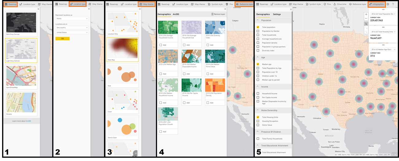
The first image below showcases the map in three forms: Filled, Heat Map, and Bubbles. The second image shows all the important customizations you can apply to the map. I will say it’s a little tricky to find the settings menu, you have to click on the elipsis (…) in the upper right corner of the visual to find the edit option. It’s important to note that you need to enable ArcGIS Map in the options menu under Preview to see it as a visualization in Power BI Desktop.
Pictured Left – Data filled by State and colored based on Category:
Pictured Center – Data breakouts by State and using a Heat Map based on value:
Pictured Right – Data breakouts by State and colored based on Category:
#1 – Base map: Let’s you pick the look of the base layer map:
#2 – Location type: You can pick between points (bubbles) or boundaries (filled):
#3 – Map theme: When location type is set to points this lets you pick between bubble types (including heat map):
#4 – Reference layer: Lets you layer on various demographics data or access the ArcGIS marketplace for other datasets:
#5 – Infographics: Lets you add in various public data cards to the upper right corner of the map:
Globe Map
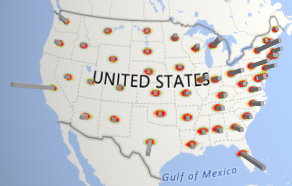
![]() Last on this list…and one I’d honestly rather skip, is the Globe Map. This visual is the only true 3D representation of map data available right now. It’s cool in concept but lacks customizations, so I don’t find it particularly useful compared to the other map visuals. It works by displaying data either as a column by location or by heat map, Neither of which is very customizable. This isn’t included in Power BI Desktop and needs to be downloaded from the Visuals Marketplace on the Power BI Website. More info about the visual can also be found on the Power BI Blog.
Last on this list…and one I’d honestly rather skip, is the Globe Map. This visual is the only true 3D representation of map data available right now. It’s cool in concept but lacks customizations, so I don’t find it particularly useful compared to the other map visuals. It works by displaying data either as a column by location or by heat map, Neither of which is very customizable. This isn’t included in Power BI Desktop and needs to be downloaded from the Visuals Marketplace on the Power BI Website. More info about the visual can also be found on the Power BI Blog.
Now The Main Course (Power BI Embedded!)
Had enough maps yet? No? Well good because now I’m going to give you full access to the report with all these maps in it. As of the time of writing this, the ArcGIS Maps doesn’t support embedded (YET) so those report tabs don’t work on this page. However if you download the workbook those report tabs are fully functional.
The dataset I used came from a post we wrote a while back, titled Red Nose Special: 24 Distinct Ways to Die. It focuses on US Census data from the last 10 years and provides some pretty fascinating “Aha!” moments pertaining to deaths by state. I won’t go into too much detail here about that post, rather let you read more using the link above. I also just counted…and I’ve managed to use the word maps 54 times in this post, impressive. With that we’ve come full circle in this article, so until next time readers. ![]()
Download the Power BI Desktop (.pbix) Report Here


