 Zoe Helps Me Answer a Long-Simmering Question

This summer we welcomed Zoe Stein (an Industrial Engineering major from Georgia Tech) to the team for a summer internship. Which is super exciting just in general – Data wasn’t really “a thing” when I was in school, and to see Engineering majors becoming interested in what we do is very encouraging/validating.
So, what exactly are universities TEACHING, when it comes to data? Well we have plenty of anecdotal evidence that Power BI *is* being taught at universities, by way of them using our book as a textbook. But overall, universities tend to shy away from teaching tools that are specific to a particular vendor, instead preferring programming languages.
And these days, the most popular such language is something called R. I’ve long been curious to get a handle on how R compares to DAX and M, and since Zoe comes from an R background at Georgia Tech, I was very curious to find out what she thought of DAX and M – after a summer of working with those tools at P3 Adaptive .
The “Exit Interview” on R vs. DAX and M…
ROB: Where and how were you introduced to R?
ZOE: I study Industrial Engineering at Georgia Tech, and I was first introduced to R in my introduction to statistical methods class. We didn’t do a whole lot of R in that class besides hypothesis testing, but my professor warned us that we would be diving into it in our upper level classes. Man was he right. We used R for nearly everything in my quality control class this past spring semester.
ROB: What kinds of projects have you implemented in R?
ZOE: Like I mentioned previously, we did EVERYTHING in R in my quality control class – homework, mini in-class assignments, and our huge semester-long project. R and I got to know each other pretty well.
I have dug deep into R in 3 specific areas: Hypothesis testing, Regression analysis, and Control charts.
ROB: Can you give us an example of each of those three?
ZOE: Sure, here you go…
- Hypothesis testing: Testing whether there is a difference between two types of sealant (Varnish and Lacquer) for 4 different types of wood, and deciding which treatment and material should to choose in order to maximize the expected value of the durability.
- Regression analysis: My group’s semester project was designing an experiment to determine the ideal factors for yielding the most popped kernels when cooking stovetop popcorn. We ran a 25-1 fractional factorial experiment – which required cooking 32 batches of popcorn – then ran the analysis in R, finding that the oil type, pot size, and temperature cooked were significant in number of kernels yielded.
- Control Charts: Given observations on the oxide thickness of individual silicon wafers, we set up a control chart on oxide thickness and a moving range chart, then determined if the process exhibited statistical control.
ROB: OK, I understand what you mean with those first two examples, and in fact they seem related. But ‘Control Charts’ – I have no idea what those are, can you explain?
ZOE: Control charts are really “just” line charts. They graph a series of data points to see whether the variations in the data are “natural” randomness or if some other factors are sneaking into your system and throwing things off.
The only thing that makes control charts special is that you calculate the average value and the standard deviation across the entire data set, and put those on the chart as horizontal lines. You then look for individual values, or sequences of values, that are “fishy.”

Example of a Control Chart
(Courtesy of American Society for Quality)
ROB: Ooh Neat! Outlier detection, kinda like Movers and Fakers but more rigorous! I can TOTALLY do that in DAX! Challenge Accepted!
ZOE: Um, did I issue a challenge? But I’m very interested in what you can put together.
ROB: (One hour later). “BOOM! Control Chart in DAX!”

This Took Me (Rob) About an Hour – and I’m Fascinated. I Want More of This.
ZOE: Woah cool!!! How difficult was it to produce that?
ROB: Honestly the formatting took longer than anything. I don’t think the native line charts in Power BI could do this yet, given all of the tweaks I had to make to the chart in Excel. But a Power BI custom visual built explicitly for Control Charts would be The Bomb for this – would save all that formatting time in the Excel chart. I’ll do a followup post on this – cuz I’m hooked, and I need more time to finish it. It’s not sliceable yet for instance, and if it’s not sliceable, it’s not finished.
OK, back to the questions… Coming from that R background, what were your first impressions of DAX and M?
ZOE: I found DAX and M to be different at first. I hadn’t written much code with either before. However, there were some similarities to other languages, which made it easier to pick up.
ROB: “How did those impressions change over time?”
ZOE: There was a learning curve, but I like DAX and M! It only took reading a few P3 Adaptive blog posts and Google searches before I started picking up even further on the syntax and being able to write it much quicker. I’m a big fan now 🙂 I’m excited to continue working in them and get to the point where I reference the internet less.
ROB: “How would you now contrast your experience level with Power BI (DAX and M) versus R?”
ZOE: I would say relatively same skill level for both, but in different contexts, since the projects I have done in Power BI and the projects I have done in R differ quite a bit. The big project I did in Power BI this summer was largely focused on determining key metrics and creating an easily drillable report to observe trends and outliers.
The work I’ve done in R has all been highly analytical – half of the time I’m only looking for a single number or very straightforward answer – “what are the statistically significant factors according to a regression model?” I feel confident in my R skills when running models in R with a static dataset, but when it comes to creating rich visuals and dynamic datasets, I will produce a mean Power BI report every time!
ROB: Very interesting… I think that is a crucial distinction. R yields “small,” specific, and statistically-rigorous answers from static data sets, whereas DAX builds a framework in which we can answer MANY different questions rapidly, against varying subsets of the data. And statistical rigor is very much possible in DAX, but it’s not what we typically do with it.
So along those lines… now, when would you use DAX and/or M vs. R, vs. both in tandem?

A Handy Comparison Reference Created in Cooperation with Zoe
ZOE: I would default to R when performing a one-off statistical test. For instance, if I were asked “is there a statistically significant difference in the number of comedy movies watched and action movies watched?” – I wouldn’t see the need to utilize PowerBI over running a hypothesis test in R.
However, as SOON as the business problem involves building a report, data refresh, or slicing… Power BI it is – “How do the movie ticket sales broken down by comedy and action genres in 2017 compare to 2016?” I do think there’s a lot of potential in using the two in tandem. A forecasting visual that I previously used in R is extremely helpful in goal setting and would be awesome to include in a report.
There are many R wizards out there building custom visuals, and I feel that soon, we will be able to find almost any R visual we could want to incorporate in a report in the custom visuals library. The opportunity to use custom R script in Power BI could prove to be extremely valuable in cases that I have yet to come across, but in the meantime, the above is how I’d make the decision of which to use.
ROB: Thanks Zoe! I’m sure we’ll be continuing this conversation over the coming year, but in the meantime, we all wish you well back at Georgia Tech this Fall.
Rob’s (Tentative) Conclusions

Based on what I’ve learned from Zoe, and what I’ve read to fill in the gaps, I think the two big differentiators are “how much statistical rigor do you require” and “how many different variations of the question do you need to ask?”
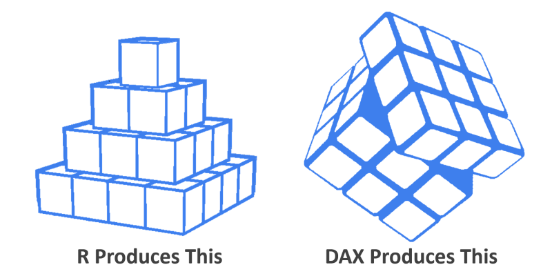
R is a procedural programming language, like C or Java. “Procedural” means you tell the computer, via the programming language, precisely what to do and when to do it. Sticking with the visual metaphor above, this means “first put this block here, then this other block there.” It builds precisely what you tell it to build, and nothing else. If you want a slightly different version of your pyramid, you have to go change the R code. If you want to see something different – even a slightly different filter, or to break your results out by Year or Product Line, the Author of the R code must do some new work. (I’m also suspicious that R doesn’t deal well with a multi-table data set.)
DAX, by contrast, is a functional programming language backed by a MONSTROUS pre-built “brain” (the SSAS Tabular engine). Once you’re done expressing the mathematical constructs you desire, those constructs are INCREDIBLY FLEXIBLE. Want to see a year over year comparison? No problem, just check this checkbox. A DAX model, in other words, can answer MANY different questions – without having to go back and modify the DAX. This gives us end-user interactivity, and it also makes things faster for the DAX author as well (cuz we don’t have to write different versions of our “code” to address a simple variation.)
So, advantage DAX in that regard. But I don’t think DAX is the right tool for “tell me which factors are statistically significant,” at least not on its face. DAX takes different intersections of values (like Temperature=90 and Product=Oil) and calculates mathematical results for those intersections (and many such intersections all at once) but it does NOT tell us, for instance, “the value of the Temperature column has much more impact on the outcome values than the Product column.” R can tell us which column, or combinations of columns, have the most impact on our outcome, and by how much (ex: Temp is 2.3x as relevant as Product). DAX takes column names as inputs, and reports outcomes based on values within those columns. It does not treat column names as outputs, which R absolutely can do.
It’s telling, in other words, that of the three R project examples cited by Zoe, I’m so intrigued by the potential for Control Charts in DAX, but not so enthusiastic about Linear Regressions and statistically-rigorous Hypothesis Testing. An interactive Control Chart is something we could build in DAX – and relatively easily I think – but damn-near impossible in R. Stay tuned.
“Hey, what About M?”
Well, M is procedural, just like R, so it carries the same characteristics of “it does one thing, and isn’t sliceable/dynamic like DAX.” Which is why I’ve made the surprisingly-controversial recommendation that you should learn DAX before getting deep into M. It’s just like the reasons why DAX trumps SQL for analysis – SQL, like M, isn’t well suited for quickly answering lots of related questions. DAX is.
But just like R is purpose-built for statistical analysis, M has its own “sweet spot,” which is data transformation and cleaning. DAX is completely unsuited for that sort of thing, which is why M and DAX are such amazing “partners” in the Power BI ecosystem. Being built for a single particular kind of task is a big advantage. Lots of R programmers perform data prep in R today, and I suspect that they’d benefit greatly from instead using M to do the data prep, and then feeding the prepped data into R for the statistical analysis. Anyone out there doing precisely this?
