I LOVE Pivot Tables – they are (in my view) the best aggregation tool available to the data analyst today. However sometimes when you aggregate your data, you find yourself at a point where you can’t see the trees for the forest. If this happens, you really need to start to disaggregate your data into the component parts that are driving the overall result. In my post today I take typical business scenario looking at the change in sales $ turnover vs prior year and then answer the question “What is driving the change in my sales $ turnover vs last year?”. This technique can also be used in comparing the change in profit (aka Margin $) too.
Sales are up – that’s good, right?
I have a modified version of the Contoso database that I have used as my test data (shown below). As you can see in the pivot table below, there has been a change in sales $ turnover vs last year of around $428m across 8 different categories – not the most realistic data, but you can still see what is going on with this data. Each category in the pivot table has performed somewhat better or worse, ultimately combining to deliver the overall result.

But the question I really want to answer is, “what is driving the change in sales $”. If you think about this question, you can actually break it down into 2 lower level drivers of the change in sales $ turnover*.
- A change in volume (ie a change in the number of units sold)
- A change in price per unit (ie a change in the rate you charge).
* In fact you can go on to disaggregate the drivers of your sales turnover in many different ways, and to a much lower level. I did this earlier in the year with my entry in the Power BI Report contest – you can read about that here if you are interested.
Writing the DAX
The DAX formulas to disaggregate the total sales $ number are actually quite easy to write. As normal, it is easiest to write a number of interim measures along the way (these each have their own intrinsic value anyway). So to start with, I have written independent measures for quantity (aka volume) and also sales value before writing the final measures I need for this task.
Volume Measures
Total sales units this year :=sum(Sales[SalesQuantity])
Total sales units last year :=CALCULATE([Total Sales Qty] , filter(all(Calendar),Calendar[CalendarYear] = max(Calendar[CalendarYear])-1))
Change in sales units TY vs LY :=if(and([Total Sales Qty LY] <>0,[Total Sales Qty]<>0),[Total Sales Qty] – [Total Sales Qty LY])
Value Measures
Total Sales $ TY :=sumx(Sales,Sales[SalesQuantity] * Sales[UnitPrice])
Total Sales $ LY :=CALCULATE([Total Sales], FILTER(all(Calendar),Calendar[CalendarYear] = max(Calendar[CalendarYear])-1))
Chg in Sales $ TY v LY :=if(and([Total Sales LY] <>0,[Total Sales]<>0),[Total Sales] – [Total Sales LY])
Average Sell Prices
Avg Price per Unit TY :=DIVIDE([Total Sales] , [Total Sales Qty])
Avg Price per Unit LY :=CALCULATE([Avg Price per Unit], filter(all(Calendar),Calendar[CalendarYear] = max(Calendar[CalendarYear])-1))
Once you have these measures, you can then move on to write the measures that disaggregate the movement in volume from the movement in price as follows.
Variance Due to Volume
In a business sense, the measure I have written below is saying “If I sold the extra units this year at the same price I got last year, how much extra (or less) money would I have”? This is therefore the variance in sales $ driven by a change in volume.
Chg in Sales $ due to volume :=[Change in sales units TY vs LY] * [Avg Price per Unit LY]
Variance Due to Price
The last measure is the easiest to write, as it is simply the total variance less the variance due to volume.
Chg in Sales $ due to price :=[Chg in Sales $ TY v LY ] – [Chg in Sales $ due to Volume]
Charting the component parts
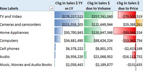
As you can see below, TV and Video total sales were up $178m vs prior year, yet there was also a decline in sales of $79m caused by lower sell prices. And Cameras and camcorders actually had an increase in sales due to sell price, and that drove the total result higher than it otherwise would have been. Of course there is normally an inverse relationship between price and volume (the lower the price, the more you sell). The trick is to maximise sales (or more correctly margin $).

Why not try this technique on your own business data. This test data is not very realistic, so the insights are not that realistic either. However analysis like this on real business data is bound to help you find things you didn’t know. It is good to know if the increase (hopefully an increase) in sales turnover has been driven by price increases, volume increases, or maybe both.
