I guess most of the readers of p3adaptive.com will already have a pretty good idea that Power Query is awesome. I spent time recently thinking about how Power Query has really opened up the data on the Internet and made it more accessible to us all. It reminded me of something I worked on a couple of years ago when I first discovered Power Query. I want to share my journey from back then to demonstrate the point about how Power Query really “Super Charges” the Internet – and because the example is just cool.
First the background
The long story short is that I was frustrated one day when SalesForce.com released its “Spring” release of its software. Now as someone that lives in the southern hemisphere, giving a software release a “northern hemisphere” season for a name is totally meaningless – let alone completely confusing. Anyway in my rage (and spare time), I set about trying to find out what percentage of the world population experiences “southern hemisphere” seasons (go figure why! – I’m just like that sometimes).
Anyway, in my journey I found a link to a NASA website that provided tables of data with the total population of the world at every 1 degree of longitude and every 2 degrees of latitude. So basically it was just a big text file 360 columns wide and 180 rows long, with each number being the population in that 2 degree square surface area of the earth – just what I needed to check the population in each hemisphere.
The text file looks exactly like this (but bigger of course).

So using Power Query I converted the text file and parsed the awkward data into usable data in Excel. Once I had the data into Excel, it was easy to write a couple of formulae to work out the answer. For the record, the answer was “not many” – less than 6% actually vs 79% for the northern hemisphere seasons (I guess it is acceptable to name your software after a “northern hemisphere” season after all – by a factor of 13 to 1). Note the balance making up 100% live in the tropics.
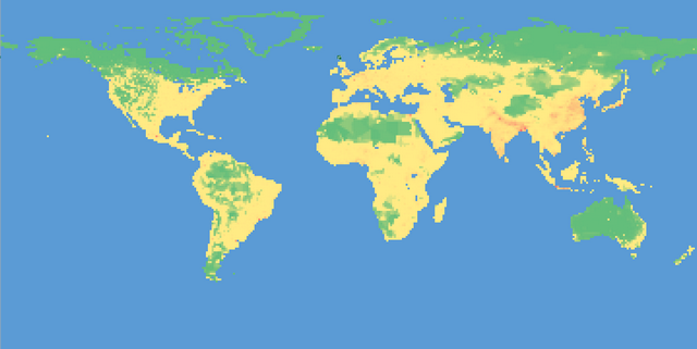
But then I had an idea – I wondered what this spreadsheet would look like if I applied conditional formatting over the top of the data. So I made the columns really narrow (about 2.0 wide) and then applied standard conditional formatting over the top, and to my pleasant surprise it looked like the image below. This image is simply a spreadsheet of values converted with Power Query from the text file above with conditional formatting applied.

Now the reason the ocean is green is because each of these cells has a zero value – makes sense I guess – zero population in the sea. So I decided to remove all those zeros and replace them with null (again using the transformation tools in Power Query) to see what that looked like, and I ended up with a more granular level of detail as shown in the image below. Power Map eat your heart out!

Here is the spreadsheet if you want to take a look for yourself.
Edit: Here is a version with changes suggested by Leonard Murphy in the comments below. I turned off banding in the table and selected a table format that has a blue background.
So what sparks your interest to explore?
There are a couple of key points about all this. Firstly there is a wealth of data available on the Internet. I guess we all know this already. But with the arrival of Power Query it has never been easier to get this data into Excel – from whatever format it is in (a TXT file in this case) – into something that you can actually use.
Hopefully this has inspired a few people to think about data they are interested in and do some recreational analysis. I would love to hear of any interesting data sets other people find and have been able to use. https://www.gapminder.org/ is one of my favourites.
___
Matt Allington is a professional Self Service BI expert, consultant and trainer based in Sydney Australia.
Interested in Learning How to Do this Kind of Thing?

Our New Online Power Query Course just launched this year. You’ll learn Power Query from the best in the business, two Excel MVPs Ken Puls and Miguel Escobar. We’ve included 7 Hours of Self-Paced Video over 31 Courses, with lots of example files, and a Digital Badge powered by Acclaim.
CLICK HERE to claim your spot.
