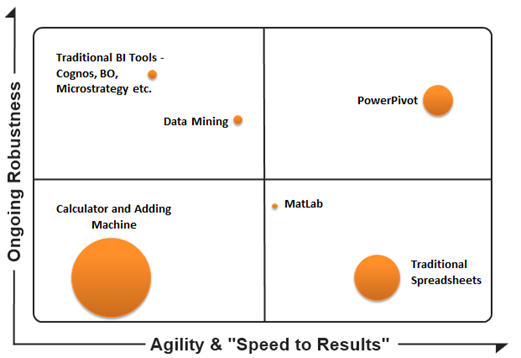
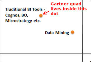
(Size of circle = Usability and “Reach” of the Toolset)
Time to Evolve a Longstanding Meme
If you’ve been around Business Intelligence for the past ten years, you’ve seen a LOT of Gartner’s Magic Quadrant. You can see the 2012 version here on Microstrategy’s web site. (Microstrategy did very well on this year’s edition, so it makes sense that they display it).
The Magic Quadrant isn’t a bad tool for evaluating BI Vendors. I like anything that breaks us out of 1-dimensional thought (I’d love to stop talking about Left/Right, Liberal/Conservative for instance). And it’s certainly been a great tool for Gartner. It gets them a lot of attention every year, like clockwork.
But the more I use PowerPivot the more I realize that the magic quadrant is too limited to handle the changes we’re experiencing in the world of data.
Gartner Measures Product and Vendor Capabilities
Look at the axes on Gartner’s quadrant. They are “completeness of vision” and “ability to execute.” I know a lot of detail goes into each axis but essentially each axis measures feature set provided by the vendor – current features, ability to add the right kinds of future features, ability to support their product, ability to remain a viable business, etc.
Those are valuable things to measure but they are not the only things that are important.
How About ROI?
In essence, the Gartner quadrant is a 2d checklist/scorecard of features (both of the product and the vendor). Wouldn’t it be just as valuable to measure the average effectiveness and ROI as experienced by the customers of those vendors? I’m sure Gartner factors that in to an extent of course, but I want to go farther:
I want ROI/Effectiveness to BE the axes on which we are measuring. That’s the only thing that matters, in the end. How effective is it for you, and how much did it cost you?
And let’s face facts: satisfaction rates with BI tools and projects are almost universally low. So when you start down the road of evaluating BI tools, you are often trying to decide which one is going to “suck the least” for you.
How About Tools That Aren’t Considered Traditional BI?
There are a lot of tools out there to help you with your data. Not all of them fall under the heading of traditional BI tools.
Every day, organizations everywhere ask themselves not only the question “which BI tool for me?” but they also ask themselves “should we even try to get a BI tool in play here?” (Oftentimes they are even implicitly asking themselves that question, thousands of times a day, and implicitly answering with “no, we’ll stick with spreadsheets.”)
I get asked, all the time, how PowerPivot compares to normal Excel. How it compares to traditional BI tool X. How it compares to data mining. How it compares to custom-coded reporting solutions.
Invariably my answer includes a LOT more than feature set. I always come back to ROI.
Example: Building Materials Distributors
We’re currently writing a case study with Microsoft about one of our customers, Building Materials Distributors. I won’t share the whole thing here until it’s done, but here are some relevant highlights:
- They essentially had no BI capability two years ago.
- They purchased a number of solutions and none of them worked out.
- They evaluated Cognos, but simultaneously were intrigued by PowerPivot. The management team there thinks very critically and independently, with a ‘rubber meets the road’ mentality. So they decided to give us (and PowerPivot) a chance first.
- They got the results they needed, from Pivotstream/PowerPivot, at a FRACTION of the cost of adopting Cognos.
- They did NOT hire any new staff to do this, and IT resources that would have been burned on BI were able to take on other critical projects.
- It wasn’t just better in terms of price though: they ended up getting BETTER INSIGHTS from Pivotstream/PowerPivot than the goals they had set for Cognos. This was not something they expected from the “cheaper” platform.
Shouldn’t we be talking about this sort of thing? And by the way, this isn’t rare. I see this everywhere I go. BMD happens to be a textbook case of it, but FAR from the only case.
Questions for YOU
First off, this is a beta ![]()
So I want your feedback:
- What should I name the four quadrants?
- I debated adding color to indicate feature completeness/maturity, what do you think? (I’d give PowerPivot a mid-range color – strong and mature thanks to Excel and SSAS’s rich histories, but younger in terms of other BI features like Mobile, number of web controls, embeddability, etc.)
- I decided against putting QlikView/TIBCO/etc. on the quad this time because I don’t know those tools very well and it would be hard for me to avoid some bias I think, but feel free to weigh in.
- What other tools should I include?
- Just general feedback/comments welcome too of course.
Leave me a comment, or email me. I am Rob. At a place called Pivotstream. Dot com.

